
Many devices around India began to receive a silent update in March 2022 that included Realme’s new Smart App Drawer, powered by Branch. I’ve spent a few weeks using the latest update, and I am excited to share my thoughts with you all.
I dug into the background on the new feature, and I’ve learned that Branch has built technology that helps power this experience in a unique way. They work with over 100,000 mobile applications to collect links to pages inside of the app, and have packaged this up to make it easier for phone users to navigate their device. I have really enjoyed using the product myself, and love the special links that show up in the drawer, so it was very interesting to learn where they came from!
My Realme phone was the first time I encountered this, but I was very surprised to learn that Branch is now powering the App Drawer experience for most of the Android phone makers such as Samsung, Xiaomi, Motorola, Vivo, OnePlus and now Realme!
Summary
I’ve loved using the feature! I’ve found that it is much faster to access my apps, either the ones I use frequently or the ones I have to search to find. Before, I would spend endless amounts of time swiping around to find the app within the App Drawer, and now I can access it in seconds by typing a couple characters.
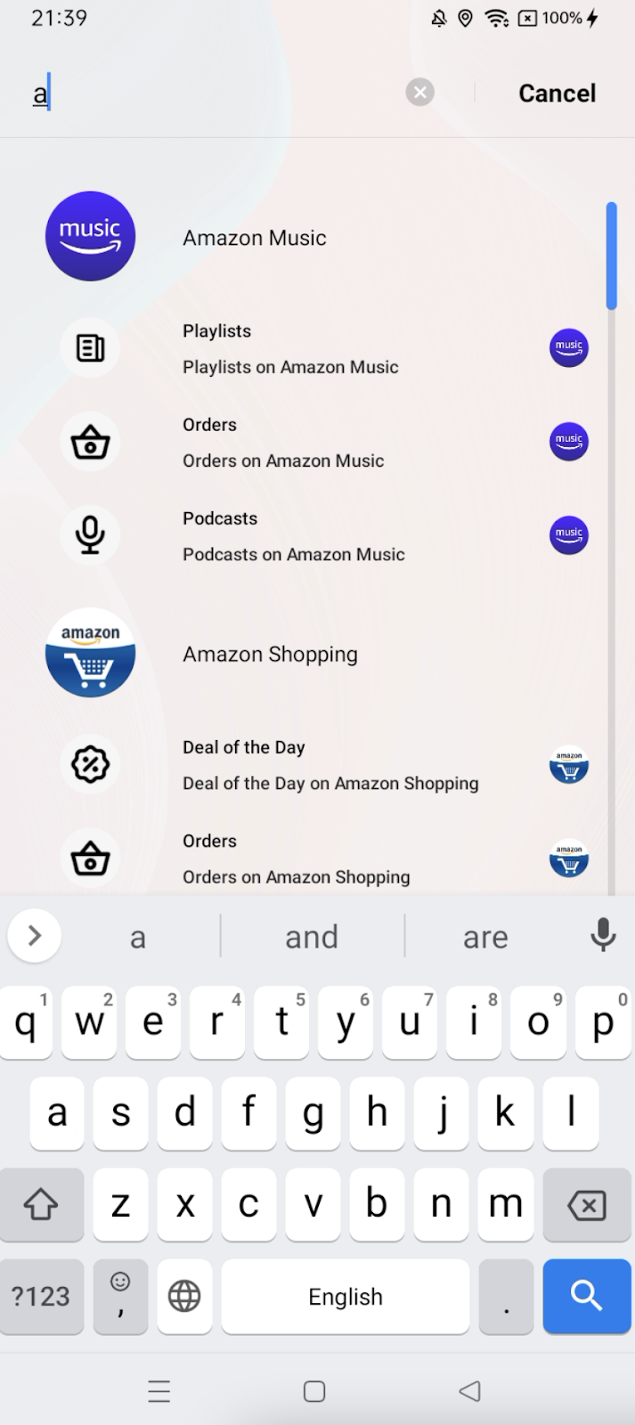
Example search of “a” to access my apps in a faster way
For my most frequently used apps, I’ve normally just accessed them on the homescreen. However, now with the new Smart App Drawer, I actually have started swiping up to access them with the quick actions and suggested links instead. It’s so much faster to open my previous chat in WhatsApp or a contact in Messages than have to find those apps and swipe around.
This is a great addition to my phone, and I’m excited to see how it can grow. I rate it 9 / 10, and it could see 10 / 10 if there were more types of deep links for my favorite apps in the Suggested Links section.
Recommendations Deep Dive
The first big enhancement are two new features placed inside the App Drawer itself. The first feature is a section where 5 apps are recommended to use, and the second is where 2 links are suggested. Below both of these features is the standard app drawer that existed before: a giant grid of alphabetized apps.
When I first enabled the feature, I found that the suggestions were somewhat generic. It picked things like Settings and Google Play, and recommended links to these more common apps. I didn’t see the apps that I use frequently.
However, as time progressed (even within the first day), I started to notice that the feature learned my habits and frequently used apps. It started to get much better, and tailor the suggestions to me. For example, I often use PhonePe to handle my payments and finances, and it would start to recommend me the app as well as well as a very relevant link to key functionality (like my Bank Balance seen below).
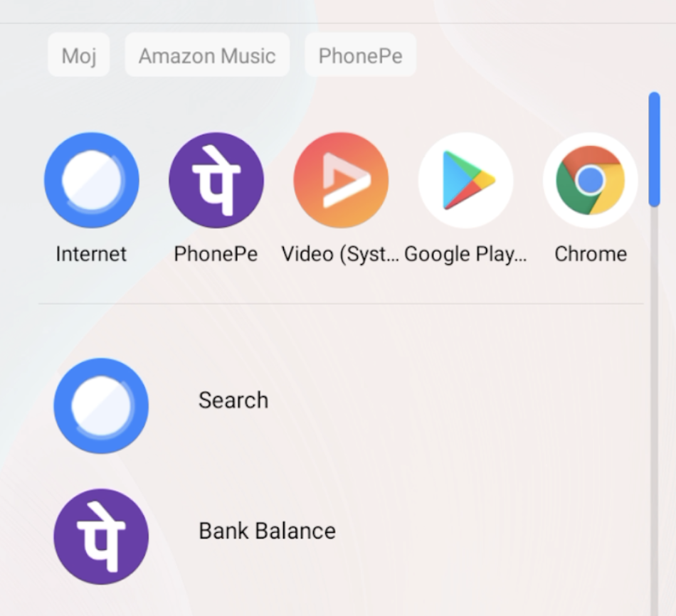
Example recommendation page that shows my PhonePe app and link to Bank Balance
I can understand how it would take time to adapt to my personal preferences, and having patience was important! The suggested apps at the top became one of my most used features, and it always seems to know what I want.
The only criticism that I have is that the links below do not always seem to have the exact link I want. Sometimes there’s a key feature of an app that I use regularly that never appears in the links. That said, I still get a lot of value out of the links it does recommend!
Search Deep Dive
While the recommendations cover most edge cases, one of the major changes in this new upgrade is a significantly overhauled search feature and that the keyboard pops up when I enter the drawer. I’ve known that the iPhone does this and was curious why it wasn’t being done on Android.
Switching from scrolling to searching didn’t take me long, and within days, I found that I was searching way more than I used to. I basically started using search for everything rather than scrolling through the giant grid of apps. It’s so much faster and efficient.
The best part about this search is that it’s incredibly personalized to me, so that I basically only need to type one or two characters and the exact app I’m looking for pops up. Similar to the suggestions page, it took a day to learn which apps I use, but very quickly started to show exactly what I was looking for.
Beyond that, Realme now shows the top links to my most common next actions. So, often, I’ve found that I can skip right to the page that I’m looking to get to rather than just opening up the app. The cool part is that I found that links I clicked from search also started showing up in my suggestions page, in a very personalized way.
My recommendation is that Realme expand to support more types of stuff within my apps. For example, on multiple occasions, I found that I was trying to search for a contact name or started typing a Google search here but realized that the feature only showed me apps. I feel like there’s a lot of potential to make this the single place where you search for everything.
Author: Shruti Shah

Bio: I love all things tech and mobile. Freelance journalist and product reviewer based in Bangalore, India.