

Not everyone can comprehend raw and complex data. They need to be processed, summarized, and presented in a format that the average person can understand. Thankfully, graphs were developed as visual representations to remedy this drawback.
A graph is an effective tool used to illustrate a set of variables in a systematized method. Because data can be overwhelming and incomprehensible to most, converting these into visuals enables relevant information to be processed in a much more digestible format. Fortunately, graph makers like Venngage can get the job done conveniently.

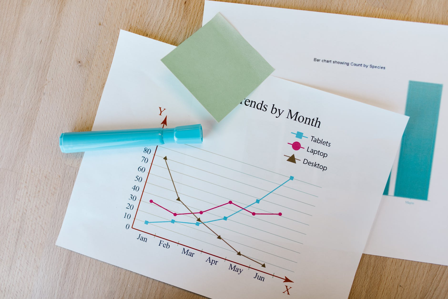
![]() There are varied graphs, and each one is better suitable than the other, depending on the amount of data at hand and the desired facts you want the audience to take away from it. Here are some of them:
There are varied graphs, and each one is better suitable than the other, depending on the amount of data at hand and the desired facts you want the audience to take away from it. Here are some of them:
- Line graphs: This is the most commonly used and the simplest one to plot. It shows data in numbers that have changed over time. They reveal a set of data’s relationship and its trend, such as average monthly sales.
- Bar graphs: This is used to show data independent of each other and is not meant to display the correlation of one variable to the other. It’s a suitable way to display categories in a more concise way.
- Cartesian graphs: The least commonly used graph in a business setting, the Cartesian graph is deep-rooted in mathematics, particularly showcasing algebraic data. With four quadrants and numbers in each axis, a minute change in one number reflects how it affects another.
The common types of graphs are covered. Next, it’s time to dive into its benefits. Here are four benefits of using graphs for your next presentation:
1. It’s Easier to Grasp
Our brain processes visual information 60,000 times faster than texts! A set of data is made up of texts and numbers that are in need of interpretation for the majority of the audience, who may not be well-versed in numerical analysis. Graphs allow audiences to quickly comprehend the overall picture of the data, its trend, and the relationship of presented values. Whereas raw data, without graphical interpretation, is just an overwhelming display of mountains of information that is not sensible to most.
Data converted into graphs are quicker to assess. In addition, it emphasizes points that would have otherwise been lost if it retained its original format.
2. Audience Engagement = Success
Data on hand is only relevant if the end-user or audience engages with the information provided. The issue with leaving valuable data the way they are instead of converting it into a more understandable visual representation, such as graphs, is that the audiences cannot interact with it. Why? It’s tricky to interact with a piece of information you don’t understand.![]()

That’s why it’s incredibly beneficial to present your data visually. Your audience will quickly understand the information presented and encourage an exchange of understanding, ideas, and solutions — if needed.
3. Efficient and Objective Decision-Making Process
Describing your data is not as effective as graphing your data. Decision-making requires precise interpretation of the correct information and analyzing the best course of action from it. Unfortunately, misinterpretations often happen when the audience comprehends written data differently when it comes to business meetings or company presentations.
Sure, Q&A and brainstorming during presentations will eliminate that possibility. However, they do drag on. On the other hand, visual data aids in conveying the information to the audience clearly, thoroughly, and timely. This means less time spent explaining details and more time allocated to move forward with solutions and decision-making.
4. It’s Visually More Appealing
Lengthy texts and rows of technical numbers crowd a space. There is no guarantee of information comprehension. Visual presentations drastically reduce information overload and fatigue. Pages of text and numerical data can fit into a singular graphic visual. The clutter that data texts and numbers naturally exhibit is remedied by transforming it into graphs.
Human beings are innately visual. So data visualized into graphical presentation instantly makes it more appealing and exciting. Moreover, free design solutions are accessible for creative inspiration right at your fingertips. Pre-made graph templates are readily available, and some are free, like customizable designs from Venngage. All there is to do is import your data set, and the rest is just a matter of choosing design details such as font type, line colors, etc., should you choose to customize.
When data is converted into any visual presentation such as a graph, the correlation of the values represented, the data’s trends, and its overall content are communicated more effectively. Put it this way; graphs are just like a picture book. Regardless of the age or educational level of the reader, it is easily understood no matter what. And at the same time, visual presentations have a higher chance of catching and retaining audiences’ attention.


